Friday, December 2, 2011

I love hand-painted type


Hey Audrey!

I love hand painted type and signs! I think it is a skilled art. And so does Hanif Kureshi, typography fundi and art director at W+K Delhi. He started a project where him and his team digitize the typograpy of Indian hand typographers, in order to preserve and support their art. You can read more about the exact process and specific artists on his website. What an awesome project to create and nurture Hanif!

Wednesday, November 30, 2011

Motherland, where work is worse

The entrance of W+K New Delhi.


Hey Audrey!

I visited the Delhi branch of world-renowned agency W+K. In their entrance they have a very striking mantra "Work is Worship", made entirely out of pencils. While I was contemplating this impressive piece I realized that I could never work at W+K, as I really don't believe work is worship. I think a Cinema Nouveau film is worship, or a pedicure, or a yoga class, but work.... work is worse. And I think most people in India would agree with me. But any way, I met with Dan Berkowitz, an art director who recently moved from South Africa to Delhi and who is now a creative director at W+K. He loves the mix of smells in Delhi. He explains that driving around on his moped, he can go from sniffing sewerage to frangipani back to sewerage to cinnamon in just seconds. He also gave me some copies of Motherland, a cool magazine that W+K Delhi publish. It contains stunning photography, and excellent lay-outs, but unlike most trendy designery magazines also has well researched and written articles about contemporary Indian issues. I really enjoyed the in-depth article on the role that astrology plays in Indian Society. How interesting that one could even get a Masters degree in astrology here. See, if I had been working, I would never have read that!

Tuesday, November 29, 2011

Avasara Academy


Mauve and sage, or lilac? And for the background: step and repeat lotus patterns, a soft photo, or big transparent lotus leaves?
Design of a different page.


My favourite version: add a bit of spicy energetic red!


The red colour scheme applied to another page.

Hey Audrey!

Whilst I was working at Ishan Khosla Design in New Delhi, I was asked to contribute to the design of the Avasara Academy website. Avasara Academy is situated in a tranquil valley outside Pune, and is a secondary school where exceptional young women are able to reach their full potential. The client really liked the website design of the African Leadership Academy, and wanted something similar. As you can see we investigated many colour schemes and background patterns, and the final result can be seen here.

Sunday, November 27, 2011

Movember silliness

Audrey Hepburn and Fred Astaire during the filming of 'Funny Face' (1957).

Hey Audrey!

I am surrounded by maverick moustaches, which will hopefully only last another day or two. Good to know that you had your moment with them too.

Monday, October 24, 2011

Crafty work

Hey Audrey!

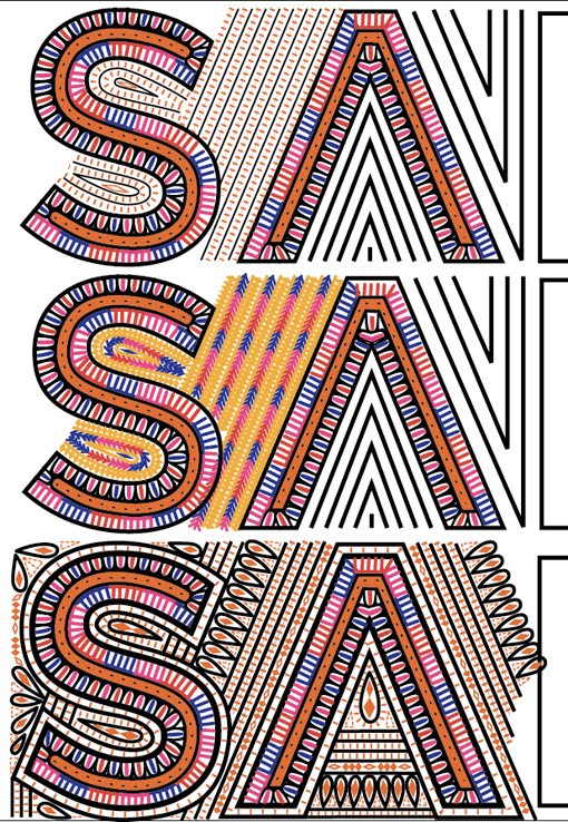
I wanted to show you some of the work I did whilst working at Ishan Khosla Design in New Delhi. We were briefed to design a logo for Sangam, a three year program focusing on design collaboration between India and Australia. The intriguing part of the brief was that the logo had to be traditionally handcrafted by one of the artisans participating in the Kala Raksha project. We started off by doing in-depth research into all the types of traditional handicraft and embroidery used in the Kutch district. The logos ended up being very detailed, and it was a challenge to imagine that every shape I drew in Illustrator would end up being stitched. Unfortunately I wasn't in India long enough to travel to the Kutch district to see my logo design being hand crafted, but Ishan documented the whole process on his blog. I love the end result on the Sangam website!

Initial designs using patchwork


These logos were presented as alternative options to the Sangam client. I included a reference to a specific artisans work that I had based that design on.


A screen shot of my Illustrator file showing the detail of the design.


Stages of crafting the final logo. The shapes had to emulate the Rabari embroidery stitching, but the letters still had to stand out.

This was the design that we worked with. Getting the first three letters right took me about a week!


The final logo implemented on the website. The colours I used initially were tweaked to be more "Australian."


Friday, October 21, 2011

The street where I lived


Hey Audrey!

A whole three months later, I am showing you the last photo I took in New Delhi, just before getting into a taxi to go to the airport. Those are our street cows, showing me their bums because they don't care that I am going home. And there is the gentleman that spends his days sweeping rubbish onto heaps just for the wind to blow it all over again. He lived in a little hut in an alley, I honestly don't know how he slept in there. One night he nearly spat on me. He didn't hear me coming down the alley, but fortunately he cleared his throat before spitting, so I waited for the fluid projectile to fly past before walking on.

Friday, September 23, 2011

Un mignon frock


Hey Audrey!

I know I haven't chatted to you in a while, but today I am excited enough to want to share this with you. My friend Carol gave me the cutest dress! It is all gingham, mini box-pleated cuteness. To add to the coolness, she found it in a vintage store in France. I love clothes, I love getting clothes, and if a favourite piece is always linked to a dear friend or family member, I love it even more. Happy Friday to you too Audrey!