Showing posts with label my work. Show all posts

Wednesday, July 3, 2013

Opposites attract


Hey Audrey!

I know a lovely couple, he is an accountant, and she is an art and music therapist. Actually they both used to be musicians, but that is not the point. I designed an identity for both of their businesses. His logo is about the precise business of ticking and turning, her flowing note logo was placed on four business card variations, and apparently even the process of picking one can be therapeutic! The only thing I insisted the two identities have in common was to be printed on environmentally sound paper. I also helped lovely Diane with her website, and used the site Weebly to do it, I was very impressed by how easy it was to use their templates (except that I couldn't control paragraph lengths) and with their good customer service. Well done over there in the USA! In the end I'm happy that they're happy.


Monday, June 24, 2013

For friends


Hey Audrey!

It was so special to be able to design my friends Candy and Stan's wedding stationery. Lucky for me, the groom, (even though a doctor) has an artistic flair. His beautiful piece of calligraphy of their names became the focal point on both the 'save the date' and the printed invitation. He also hand illustrated the map to the venue, and it is his beautiful calligraphy on the outside of the envelopes. We used The Letterpress Company for printing, and Candy, her mom and myself spent a happy afternoon with them selecting paper, debossing stamps, and the exact right tissue lining for the inside of the envelopes. We were thrilled with the end result. The wedding day was absolute perfection, and I wish them both a long and happy life journey together.

Photographs courtesy of the happy couple.


Sunday, February 3, 2013

Shades of blue


Hey Audrey!

I recently had the privilege of working with renowned artist Virginia MacKenny on the catalogue for her Waymarker exhibition at David Krut. She had painted an exquisite set of blue-toned watercolours, painted during her Camino pilgrimage on France. Each postcard was painted at a different stage of the pilgrimage, and to emphasize the waymarker idea, she wanted the catalogue to be in the form of an old-fashioned postcard flipbook. The postcard flipbook was printed on 100% recycled Reviva paper.

Monday, December 24, 2012

Designs on Christmas


Hey Audrey!

Tomorrow is Christmas Day, and I'm looking forward to spending the day with my family. I wanted to show you my favourite Christmas designs. Two posters I designed for a beauty shop for my friends at Engage, using paper cut-out snowflakes as the main graphic element. The idea was that the ladies at a local empowerment centre could make these, and that they then could be sold in-store. The next design is a Christmas card for WIP Holdings that contained a set of gift tags. I designed the Christmas icons using the circles of their corporate logo. Have a happy Christmas Audrey!

Friday, November 30, 2012

Logo no yes?


Hey Audrey!

I saw a logo competition for the Ishikawa Prefecture on the Design 21 website. This 'province' in Japan is well known for its rich traditional culture and high-tech industry. The logo would certify excellent Ishikawa products as 'Premium Ishikawa Brand' and promote them to the world. It was quite a challenge to design something for a place I've never been too. But I did some research and found that the Prefecture's Bird was the Japanese Golden Eagle. I decide to combine an image of an egale with the geographical shape of the Prefecture, using a Japanese painting style, and soem hours later this logo emerged. Audrey, have you ever been to Japan? I would love to go and see a typical Japanese garden. And the cherry blossoms.

Wednesday, September 26, 2012

'Ons Plek' safe space


Hey Audrey!

I am so excited to just have launched my new social design company SideBySide. I look forward to doing work with clients that are making a change in the world. You can read all about our first project for Ons Plek Projects on the SideBySide blog.

Sunday, September 2, 2012

Beautiful boots


Hey Audrey!

These are promotional postcards I designed for custom footwear designer Astrid of Bohéme. I told you a few posts ago how much we enjoyed the photoshoot, remember? I wanted to add a lace element to emphasize the burlesque idea, and did some ink illustrations for this, but I think the real lace overlays looked better in the end.

Monday, August 27, 2012

Hello Skin


Hey Audrey!

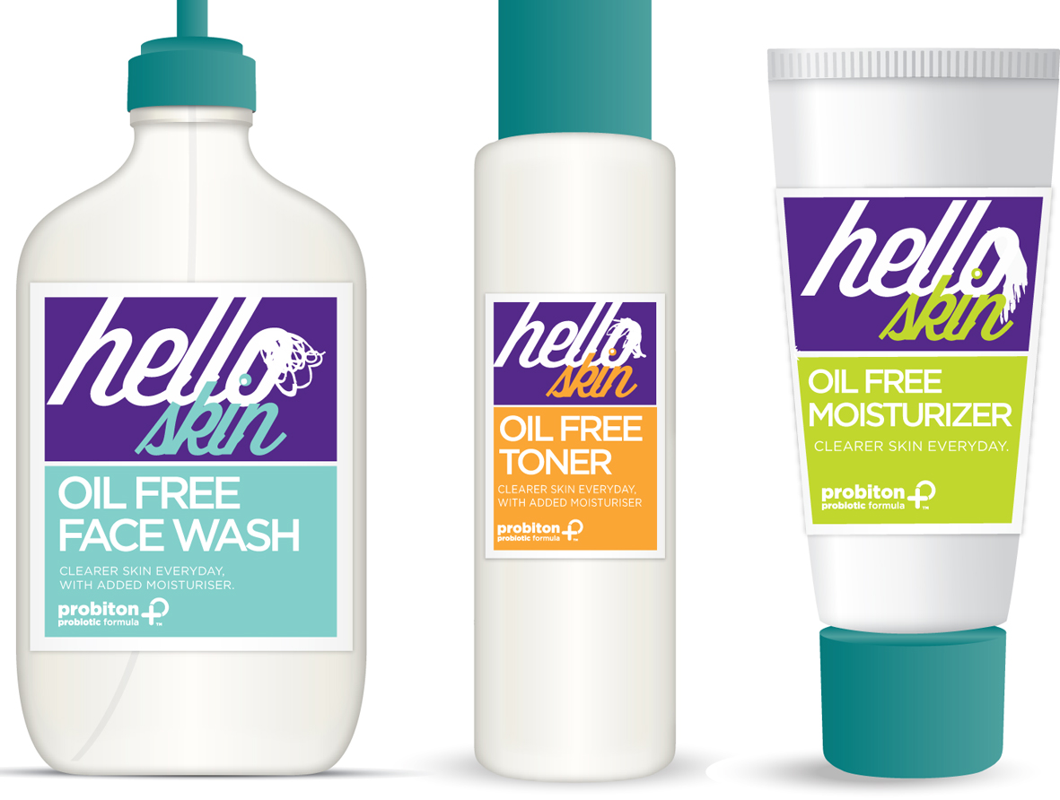
I recently worked on a packaging design for a skin care range aimed at teenagers for the cool people at Engage Brandcraft. One of my ideas was to use teen faces peeking out from under a fringe, the other was copy driven: I looked at phrases or sayings teens are currently using and tried to link it to the nature of the product. I had fun!

Monday, June 18, 2012

Quite a SSStory


Hey Audrey!

I have just finished a logo for a client,  and it took quite a lot of 'S' designs to get it right. So now I have made an 'S' family, and they can live happily ever after on this blog. 

Monday, April 2, 2012

Birthday beauty


Hey Audrey!

One of my favourite things about birthdays is creating the birthday invites.
Here are two images I created for birthday invites. One was a collage for a picnic in a beautiful park with a fish sculpture in a pond, the next one was for a traditional German coffee afternoon that my German mom made all the cakes and the cutest cheese hut for.

Monday, March 26, 2012

Hey Audrey business cards


Audrey in the 1963 film 'Charade', dressed by Hubert De Givenchy.

With co-star Cary Grant.


Hey Audrey

I just wanted to show you the business cards I designed for my design business called (surprise!) 'Hey Audrey'. I made some sketches based on some of your most famous movie moments, and on the reverse side used some of your famous lines, like the witty one from Charade (written by Peter Stone). I used 1 colour printing (my favourite red) on a recycled paper stock. I never grow tired of them, and I hope neither do you!

Monday, March 12, 2012

My cat as a computer


I love working on/in my bed: with my Macbook Pro and my beloved cat, Venus.


Hey Audrey!

One night, I was working on my laptop in bed and feel asleep. (I was working hard and it was late). My new laptop slipped off the bed, and when I woke up in the morning, I found it lying on the floor with a small but noticeable dent in it. Ugh, how frustrating! That's when I started wishing that my laptop were more like my cat, who I can roll off my bed and land on all fours. And when I roll onto her she just wriggles herself free an sleeps further. Now why can't a laptop be more like that. So I dreamt up this inflatable laptop. One can spill on it, jump on it, throw it across the room in a rage and it will be fine. I also submitted the design as a project for my Masters in Digital Art at the Wits School of Arts. One day Apple will think of this too!


Sunday, February 26, 2012


Hey Audrey!

A friend recently told me about archetypes, especially as defined by Carolyn Myss. We can choose the archetypes that are most significant in very aspect of our life, and learn to understand ourselves better, but also to shift and to grow. I found it interesting that we all have the saboteur, the victim, the child and the prostitute as part of our personality make-up. So this is an etching, (combined with colour pencil and watercolour), I made for someone special, symbolizing his warrior archetype, after a story he told me about a very tenacious moth that featured at a big moment in his life.

Monday, December 5, 2011

This is what I learnt in India


Community: In the Northern city of Amritsar, the beautiful Golden Temple of the Sikhs is to be found. The Temple is open to a constant stream of pilgrims, 24 hours a day, 7 days a week. Sikhs from all over the world volunteer at the temple at least once in their lives, doing day-to-day tasks such as washing the mounds of dishes, cleaning, peeling onions or serving the pilgrims in the dining hall. A filling meal consisting of freshly baked rotis, dhal and chai is available at any time of the day and night. The sight of such a mass of people, gathered for the same purpose, peacefully eating and chatting together, made me understand what community should be.


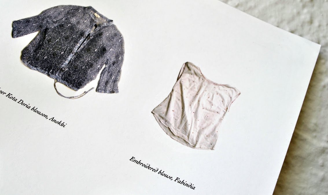
Craft: These are the textile items I bought in India. The patterns were created using the ancient tradition of blockprinting, using intricately carved wooden blocks such as the one on the left. This craft is mainly centered in and around the city of Jaipur. I loved it that upmarket city chain stores such as Fabindia and Anokhi supported rural crafters, not only by buying hand-crafted merchandize from them, but also in helping them to set up and run small businesses. Fashion designers collaborate with the crafters to create items that would appeal to a modern market. The use of a Craftmark ensures true appreciation for and loyalty to local craft and crafters.


Calm: These 11 simple items are the worldly remains of Mahatma Gandhi. They are exhibited at the Gandhi Smriti in New Delhi, the residence where he was assassinated in 1948. This home is now a museum commemorating Gandhis life and final hours. The idea that the man who changed a country and the lives of so many people, could do this with such few material possessions, instilled in me a sense of calm. I realized that I don’t have to frenetically acquire things in order to live a worthy life.


This floral pattern is carved in relief on the marble dado level at the Taj Mahal in Agra, known as the most beautiful building in the world. The Mughal emperor Shah Jahan built it in honour of his favourite wife, Mumtaz Mahal. About 20 000 workers laboured for 22 years to complete this exquisitely detailed garden tomb. The emperor kept on spending time and effort on the complex, so much so, that his son locked him up in a palace to stop him. This is where he died, in a room with a view on the Taj Mahal from across the river.


Compromise: I used auto-rickshaws (referred to as ‘autos’) to get to and from work every day. The autos cruise the streets, congregate at markets, and are equipped with meters. I was advised to be firm with the auto drivers; to insist on them using the meter and to drive safely in traffic. Therefore my first trips were accompanied by heated English/Hindi arguments which I always seemed to lose. To avoid insanity, I decided to compromise; to sit back and shut my eyes, and to not expect any form of consistency. I realized that every trip seemed to reflect the personality of the drive.

Hey Audrey!

I recently exhibited a series of posters describing five important things I learnt in India. I fell in love with the typeface I used; Cochin. I especially love the italic version.

Tuesday, November 29, 2011

Avasara Academy


Mauve and sage, or lilac? And for the background: step and repeat lotus patterns, a soft photo, or big transparent lotus leaves?
Design of a different page.


My favourite version: add a bit of spicy energetic red!


The red colour scheme applied to another page.

Hey Audrey!

Whilst I was working at Ishan Khosla Design in New Delhi, I was asked to contribute to the design of the Avasara Academy website. Avasara Academy is situated in a tranquil valley outside Pune, and is a secondary school where exceptional young women are able to reach their full potential. The client really liked the website design of the African Leadership Academy, and wanted something similar. As you can see we investigated many colour schemes and background patterns, and the final result can be seen here.

Monday, October 24, 2011

Crafty work

Hey Audrey!

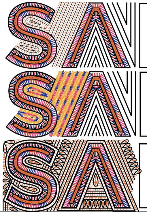
I wanted to show you some of the work I did whilst working at Ishan Khosla Design in New Delhi. We were briefed to design a logo for Sangam, a three year program focusing on design collaboration between India and Australia. The intriguing part of the brief was that the logo had to be traditionally handcrafted by one of the artisans participating in the Kala Raksha project. We started off by doing in-depth research into all the types of traditional handicraft and embroidery used in the Kutch district. The logos ended up being very detailed, and it was a challenge to imagine that every shape I drew in Illustrator would end up being stitched. Unfortunately I wasn't in India long enough to travel to the Kutch district to see my logo design being hand crafted, but Ishan documented the whole process on his blog. I love the end result on the Sangam website!

Initial designs using patchwork


These logos were presented as alternative options to the Sangam client. I included a reference to a specific artisans work that I had based that design on.


A screen shot of my Illustrator file showing the detail of the design.


Stages of crafting the final logo. The shapes had to emulate the Rabari embroidery stitching, but the letters still had to stand out.

This was the design that we worked with. Getting the first three letters right took me about a week!


The final logo implemented on the website. The colours I used initially were tweaked to be more "Australian."